003 / Municipal news module
CivicPlus News Module
CivicPlus's News Module powers thousands of municipal websites, and every story on it got the same card. A featured section and a categorized search made the difference between an announcement and routine news visible again, and shipped across 5,000+ government sites.
City Council approves new park budget
Jan 1
- Road closure on Main St this weekendLocal
- Public safety training grant announcedBusiness
- Winter farmers market schedule postedEvents
- New recycling pickup calendar for 2026Local
- City council meeting minutes, DecemberBusiness
The featured story stays pinned regardless of filter. It's a different card, not a member of this list.
A working miniature of the interaction. The frames below are from the project itself.
CONTEXT
Over 80% of citizens said they'd rather find civic information online than call in, and the News Module was making that harder, not easier.
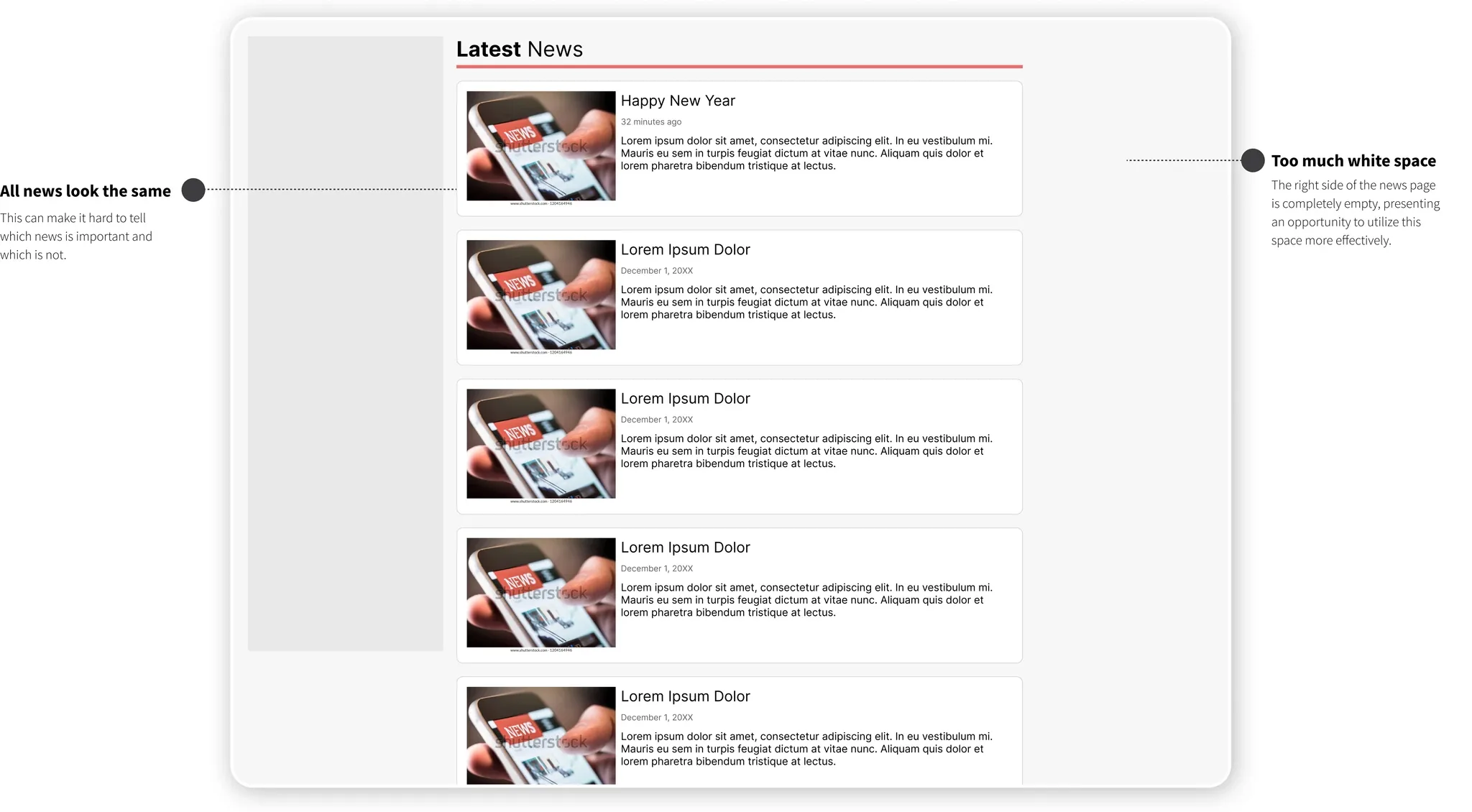
The Old News Module had one visual treatment for every story: a policy update read exactly like a routine press release, and a citizen looking for one had to read past all the others to find it.
The brief came out of CivicPlus's own survey data. Online was already the channel people preferred for policy updates, health alerts and local events; the module just wasn't organised to reward that preference.
FROM THE BRIEF
Important updates from the city often get mixed up with regular news. This makes it harder to spot these key announcements among all the usual news.
PROBLEM / 01
Every story got the same treatment
The Old News Module used one card design for a parking ordinance and a public safety alert alike. A citizen who wanted the urgent thing had to read past everything else to find it.
PROBLEM / 02
Important announcements read like routine news
Important updates from the city often got mixed up with regular news, which made it harder to spot these key announcements among all the usual posts.
PROBLEM / 03
Half the page did nothing
The right-hand side of the news page sat empty on most municipal sites, space that could have carried search or categories instead of white space.
GOALS
Before I drew a single screen, I had to know what success looked like.
Success criteria came before any design, so the work had something to be judged against other than taste.
COMMITTED TO
- 01User: navigate easily to the information they want, with important civic announcements visible on the page, not buried in a list
- 02Business: increase engagement on the news page to improve communication with citizens
- 03Product: ship the new features inside the existing design standards, not around them
RESEARCH
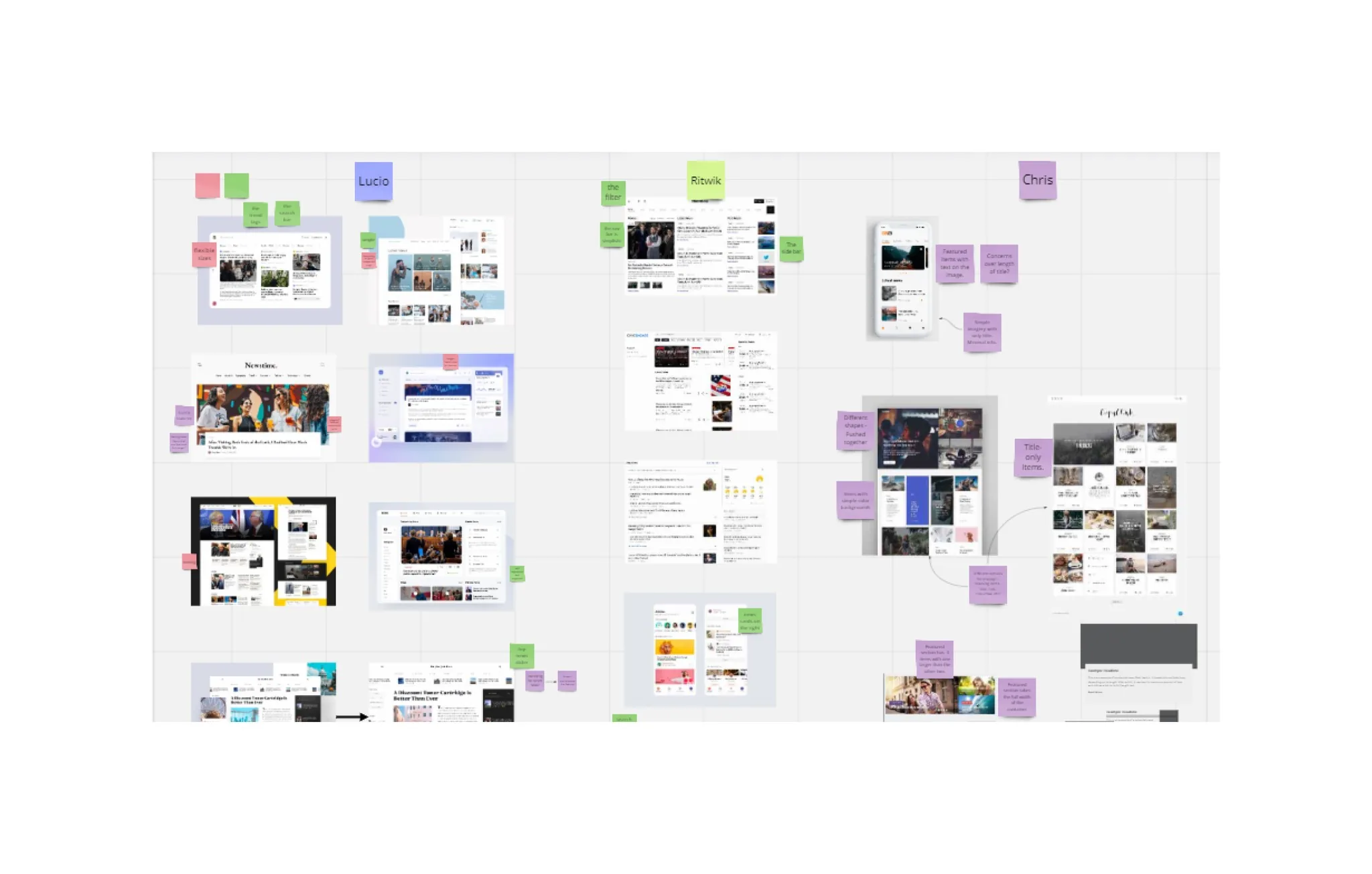
Before drawing anything, we ran a competitive analysis to see how other sites actually segmented news for engagement.
The assignment came out of the ticket queue: look at how other forward-thinking brands structured their landing pages and news sections, and bring back what was worth borrowing.
A design sprint with the lead designer, run over Miro, turned that research into a shared board: three of us pinning screenshots of news sites side by side and calling out what each one got right.
THE ASSUMPTION
- 80%+
- Of citizens said they preferred finding policy updates, alerts and local news online, per CivicPlus's own survey
A featured section was the missing piece
The competitive analysis confirmed what the team suspected going in: sites that separated a small set of important stories from the general feed made engagement easier to earn.
Categories mattered more once the module scaled
Categorized search came out of the same analysis, then grew once client feedback came back: individual municipalities wanted to define their own categories, not just pick from a fixed list.
IDEATION / 01
I gave important news its own card, not just a badge.
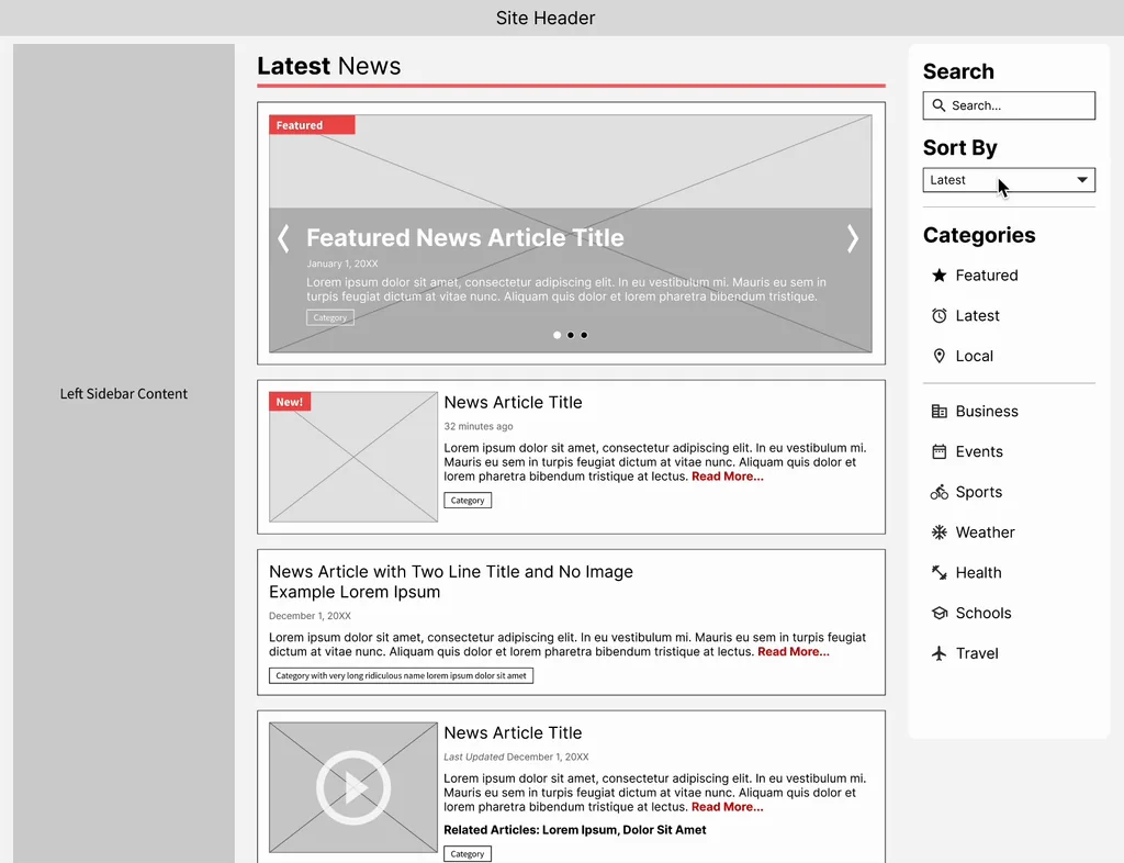
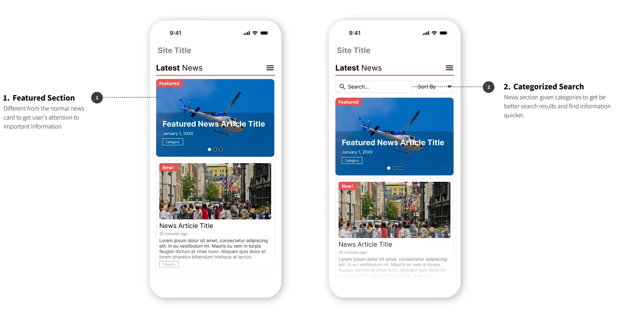
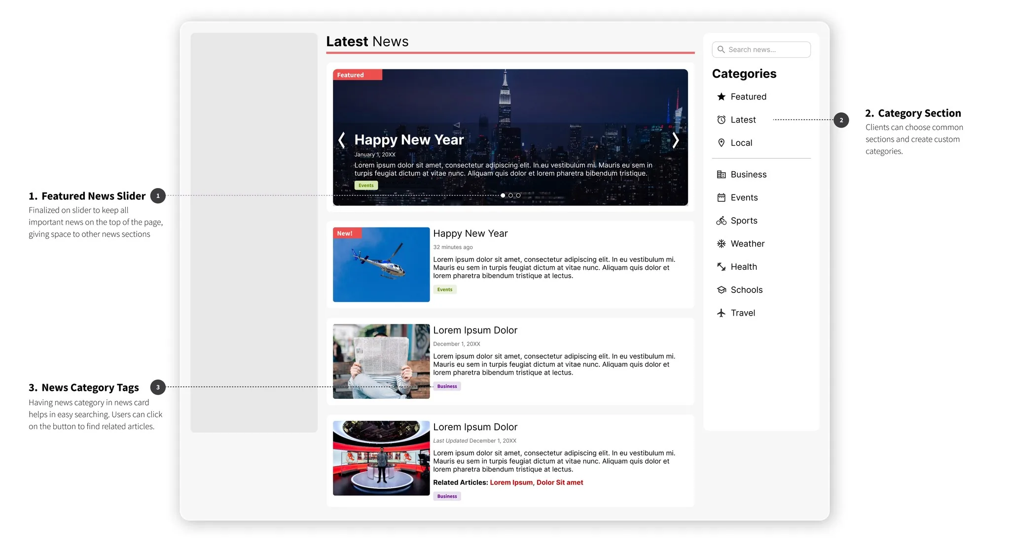
The featured section uses a visually distinct card and sits in a slider at the top of the page, structurally separated from the general feed rather than just tagged within it.
IDEATION / 02
I put search and categories where the empty space was.
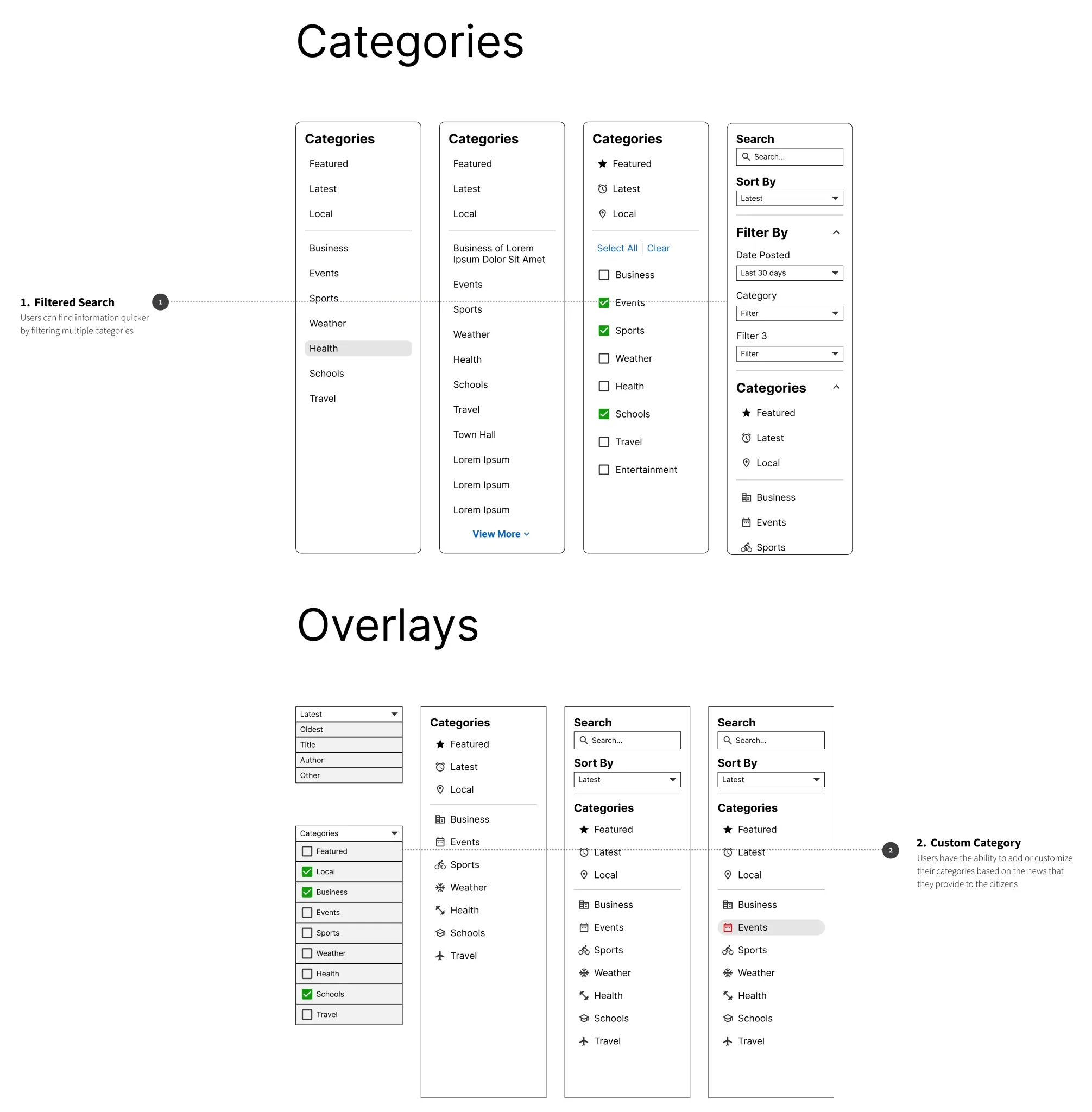
The right column that used to sit blank became the categorized search: common categories out of the box, plus the option for a municipality to define its own, since every city's news doesn't sort the same way.
IDEATION / 03
I kept the existing design system as the constraint, not an afterthought.
The product goal was explicit: ship the new features inside current design standards. Every wireframe round was checked against that before it was checked against anything else.
EVIDENCE
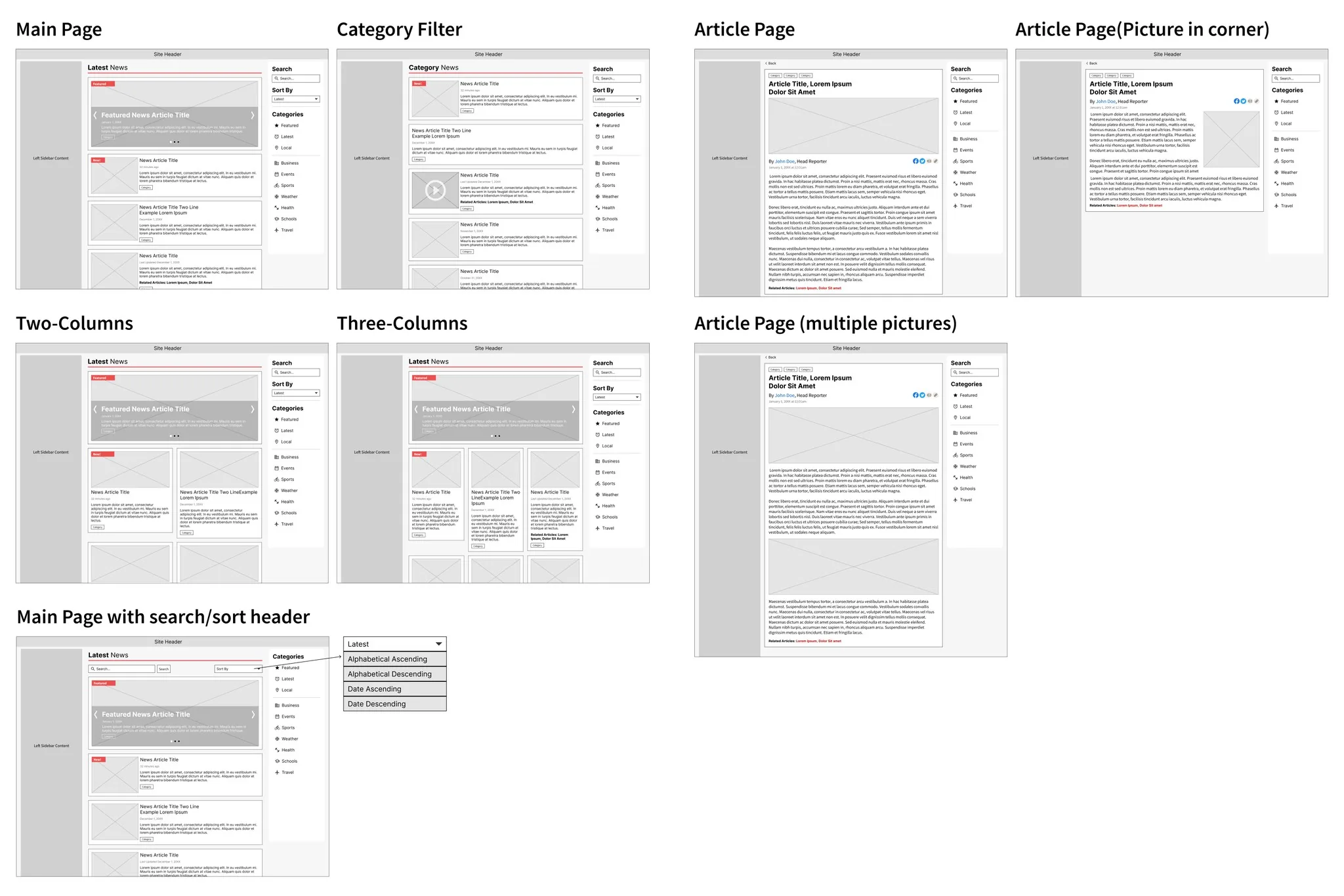
The interface, screen by screen
Screens and research artifacts from the project itself, not recreations.
THE PIVOT
The first round of wireframes got a green light and a longer list of requests.
Presenting the initial wireframe in the company-wide meeting settled the biggest question, that the featured section was worth building, and opened three more: a dedicated search page, a news-card layout that didn't depend on an image, and mobile wireframes for all of it.
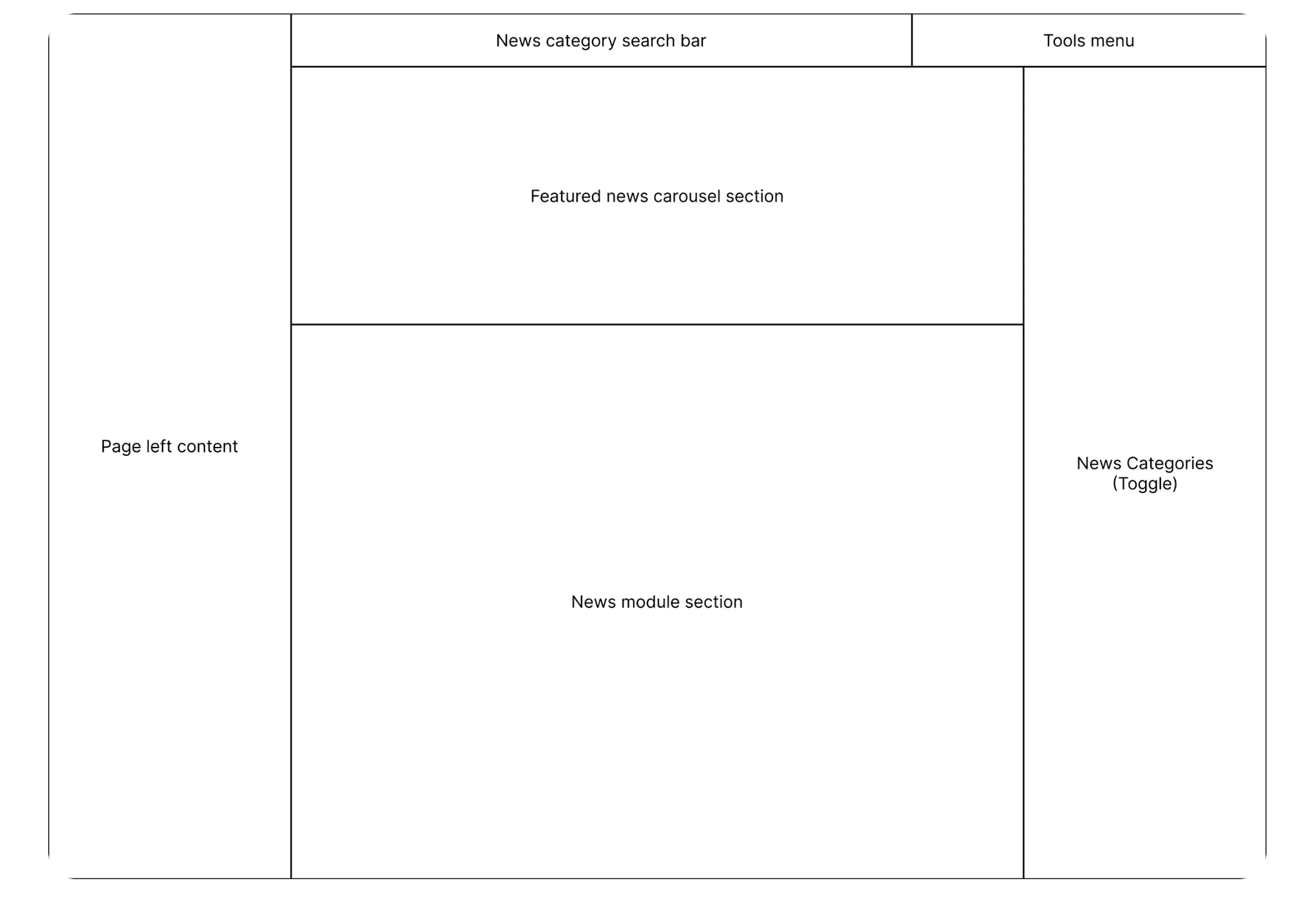
ROUND 1
Featured section, three layout options
Main page, category filter and article page wireframes, tested in one-, two- and three-column layouts.
FEEDBACK
Approved, with more to prototype
The featured section shipped as a concept. The ask that came back: a search results page, image-less news cards, and mobile.
ROUND 2
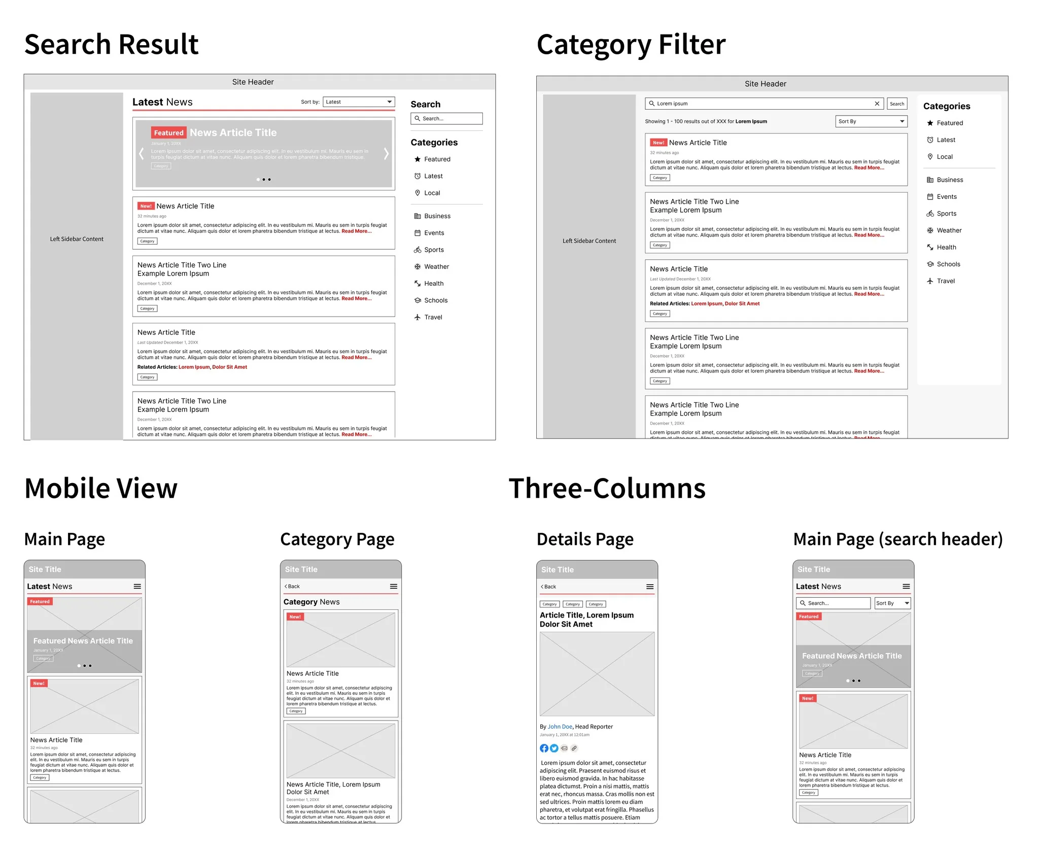
Search, mobile, and category depth
A second competitive-analysis pass fed a second wireframe round: search results, refined category filters with checkboxes and custom categories, and full mobile screens.
FINAL SOLUTION
Two sections, shipped to 5,000+ municipal websites
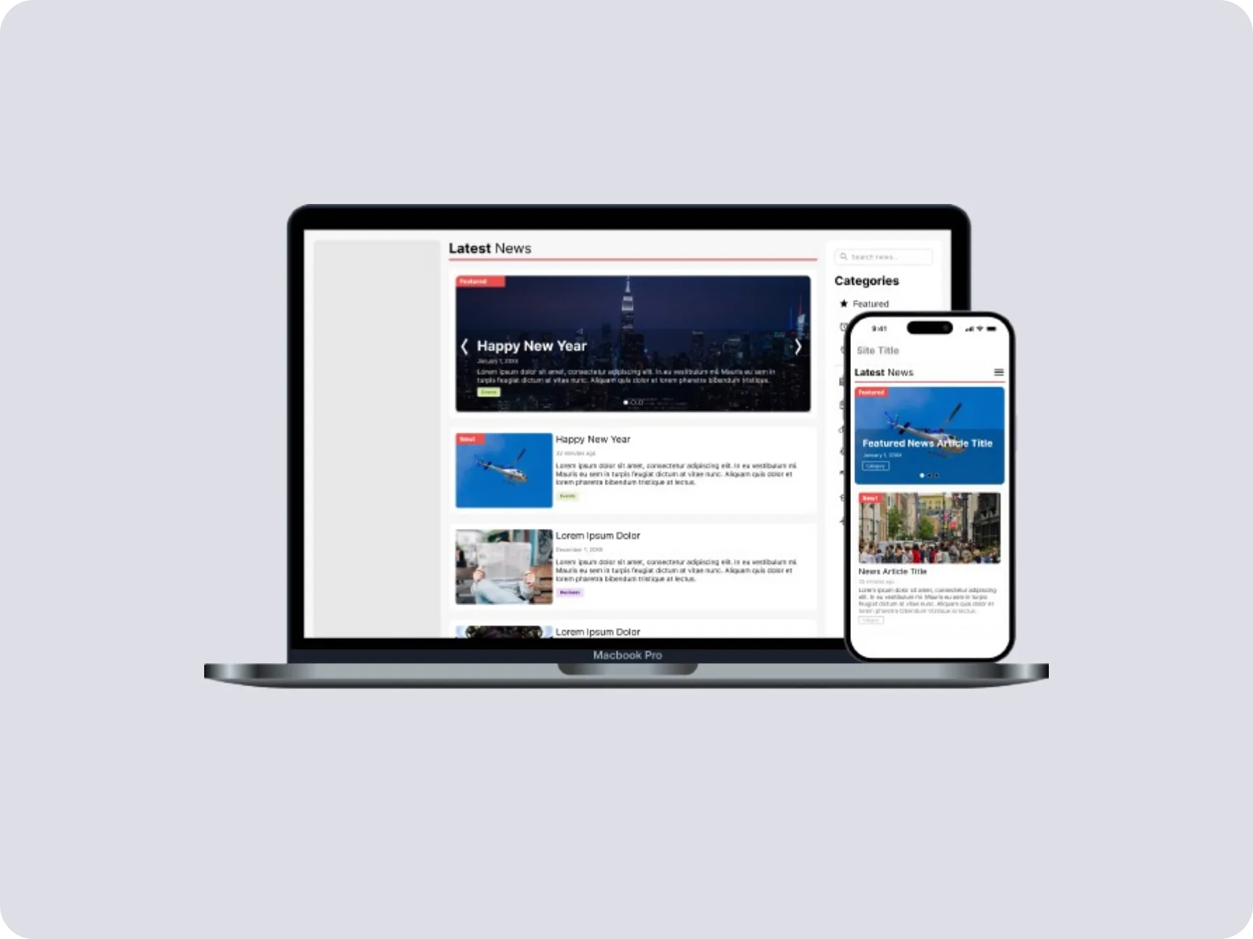
- A featured-news slider, visually distinct from the general feed, pinned to the top of the page
- A categorized search section filling the sidebar that used to sit empty, with client-defined custom categories
- News category tags on every card, carried through to search and filter results
- Mobile wireframes and layouts for the main page, category page and article detail
IMPACT
- 5,000+
- Municipal websites running the updated News Module
- ~70%
- Increase in news-page engagement after launch
Recognised in a company-wide meeting for introducing the featured section. Engagement numbers pending employer sign-off; a placeholder beats a figure I cannot source.
REFLECTION
The empty half of the page was the feature waiting to happen
The instinct was to fix the crowded side of the page. The actual opening was the side that had nothing on it. Once the featured section proved a second visual tier was worth building, the blank sidebar stopped being empty space and became the obvious place to put it. The best requests came after the first version shipped, not before it: nobody asked for image-less cards or custom categories until they saw the real thing and found the gap themselves.
THE LINE THAT MATTERED
The empty half of the page was the feature waiting to happen.