001 / Agentic test automation
Perforce Autonomous Testing
Perforce runs five separate QA products with no shared system between them. This is the platform built to unify them, and a genuine 0→1: the design problem was never the AI's capability, it was earning enough trust that someone would hand it real work.
Run the checkout suite on iOS 18 and tell me what failed.
awaiting run
The checkout suite ran twelve scenarios against iOS 18. Nine passed and three failed. The failures were payment-method-select, which timed out waiting for the sheet, apply-promo-code, which asserted on stale copy, and guest-checkout, which could not resolve the address field. Overall pass rate was seventy-five percent, down from ninety-two on the previous run.
A working miniature of the interaction. The frames below are the design files themselves.
CONTEXT
Five products, never one system, and this platform had to prove they could be.
Perforce runs five separate QA products, BlazeMeter and Perfecto among them, plus three more, each shipped with its own login and its own vocabulary. None had ever been designed to work as one system.
This was a genuine 0→1: the first product of its kind at Perforce, with no existing product to redesign around. What got built first was BlazeMeter and Perfecto specifically, not redundant tooling to trim, but two strong products confirmed, by mapping their features against real usage data, to have never been designed together.
It still wasn't a clean slate visually. The product went through four names before it shipped, and the interface carried the leftovers: an old logo lockup in the sidebar, per-app navigation holding things that belonged in settings.
PROBLEM / 01
The brief was to remove a requirement, not add a feature
Not "build a new tool": the brief was to remove the reason someone needed to be an expert before they could use one.
PROBLEM / 02
Scripting one complex test could cost a working day
Eight to ten hours to script a single complex test, and maintenance was worse than creation. One UI change could break tests by the dozen.
PROBLEM / 03
The feature already worked. Almost nobody used it.
A no-code feature that already worked, with near-zero errors, and almost nobody used it. They weren't avoiding it because it failed. They wouldn't hand it real work.
ADOPTION OF A FEATURE THAT ALREADY WORKED
25%
Of accounts had ever opened it
10%
Of manual testers had ever tried it
GOALS
Before I drew a single screen, I had to know what success looked like.
Success criteria came before any design, so the work had something to be judged against other than taste.
COMMITTED TO
- 01Unify functional, performance and mobile testing into one product
- 02Plain language in: no tool-specific vocabulary required before a person can start
- 03Design for a real spread of technical comfort, not power users with a friendlier coat of paint
- 04AI shows its work and stays inspectable, trust earned incrementally and never asked for upfront
- 05Treat "conversational is the right model" as a hypothesis to validate, not a given
RESEARCH
Before I trusted my own read of the problem, I went looking for data that could prove it wrong.
Usage data came before opinion, because assumption and reality kept disagreeing with each other. Interviews followed to interpret the data, not replace it: manual testers, automation engineers and QA leads recruited as strangers on LinkedIn, with no tie to Perforce to color what they said.
One number upended a firm assumption going in. Against a belief that users "rarely update tests," the real average was about thirteen updates to a single test.
THE ASSUMPTION
- ~13
- Updates made to one test, on average, against a belief that users "rarely update tests"
Skill silos were real friction
Testers were blocked waiting on separate accessibility and certification teams before their own work could even start. It validated the whole idea of unifying the tooling in the first place.
Nobody trusted AI to execute
The most anyone would let it do was something occasional and exploratory, like a search engine for when they were stuck: generate cases from a doc, summarise a log. Nothing that touched real work.
IDEATION
The five people who'd eventually touch this ranged from a stakeholder who might never open it to an engineer who already trusted machines to execute.
Trust extended, not raw skill, is what actually separated them. Placing them on one spectrum, rather than treating each as an unrelated user type, kept the interface honest about who was still deciding whether to trust it and who already had.
THE DECISION THAT FOLLOWED
AI PROPOSES
Generation is never the only path
The AI drafts a first version, but it is never the only way in.
STRUCTURE STAYS VISIBLE
Suites, scenarios, environments stay readable
Nothing the AI builds hides underneath a summary.
THE USER EDITS
See it, change it, run it
Never approve a black box.
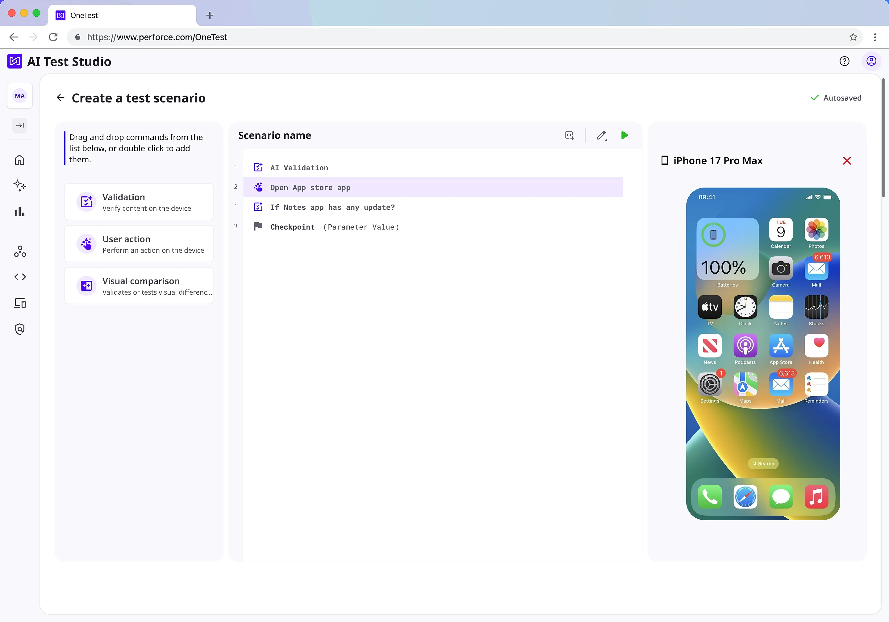
Novices describe a test in plain language and the AI builds it. Experts open that same test and edit every step by hand. The scenario editor at the top of this page has to be both at once.
IDEATION / 01
I made the agent render its answers instead of narrating them.
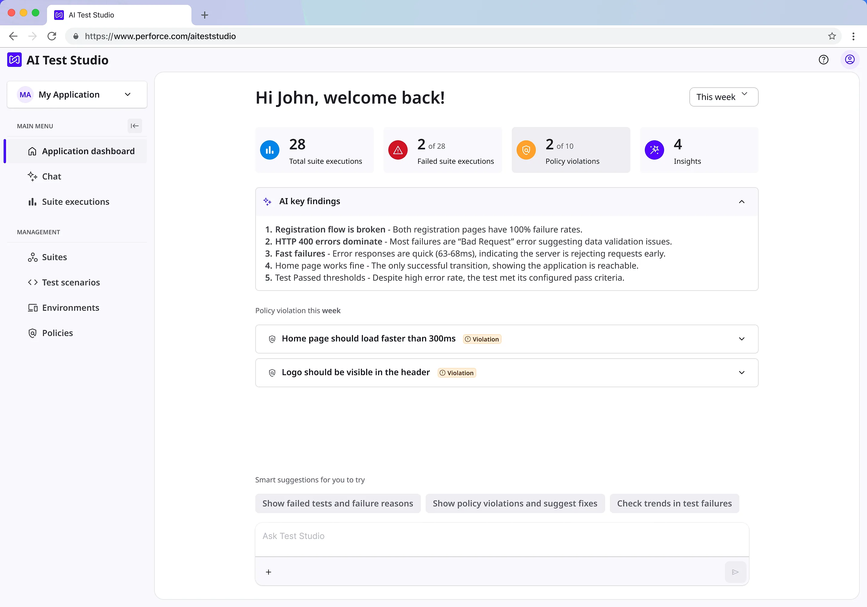
Agents emit a UI specification and the client renders it inline through a widget registry, so a result becomes a table, a chart, or a card in the thread. Prose stays for reasoning; structure gets structure. The transition matters as much as the widget: an answer that snaps from text to table reads as two different answers, so it resolves through a brief blur instead.
IDEATION / 02
I gave the work a visible state while it ran.
An activity indicator reports which specialist is active while it works. It is the smallest possible answer to the real question during a long run, which is not 'what is the result' but 'is this still alive'.
IDEATION / 03
I kept the shell in place instead of collapsing it.
When a thread panel opens, the navigation shrinks to icons rather than disappearing. Collapsing wins a few pixels and costs the user their position in the product; shrinking keeps the map on screen while the conversation takes the room it needs.
IDEATION / 04
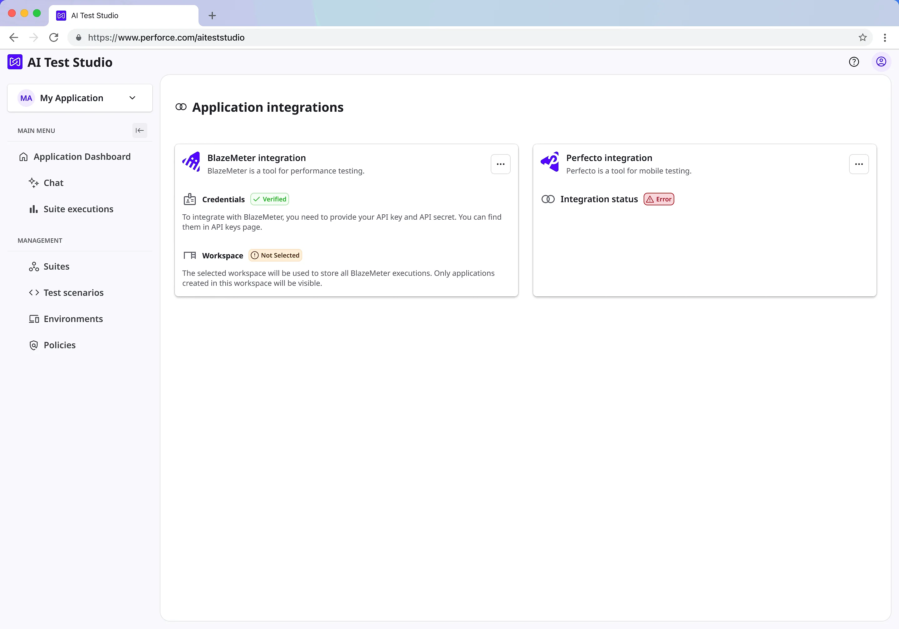
I moved account-level concerns out of the app sidebar.
Integrations belong to the account, not to the application you happen to have open. Relocating them is a small diff and a permanent reduction in how fast the sidebar can grow.
EVIDENCE
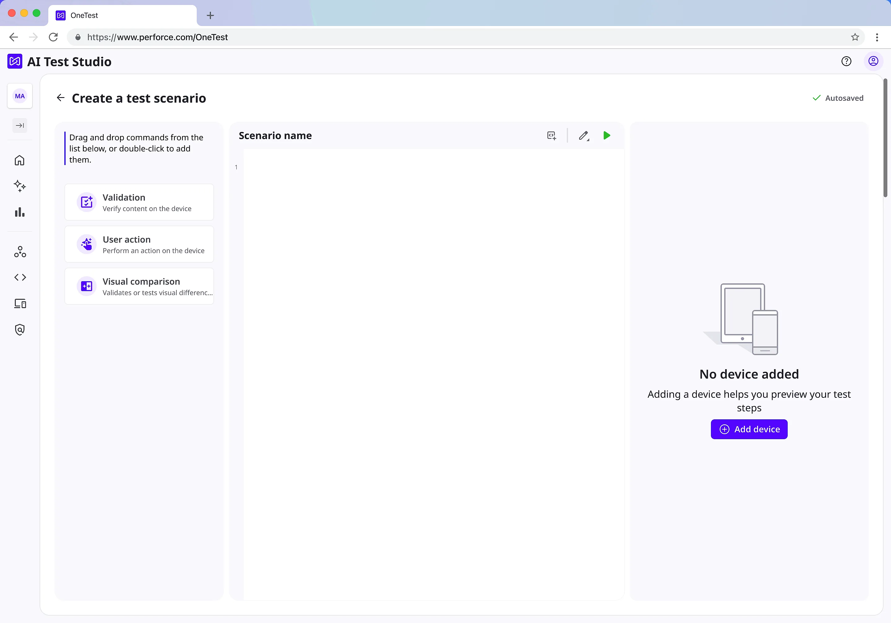
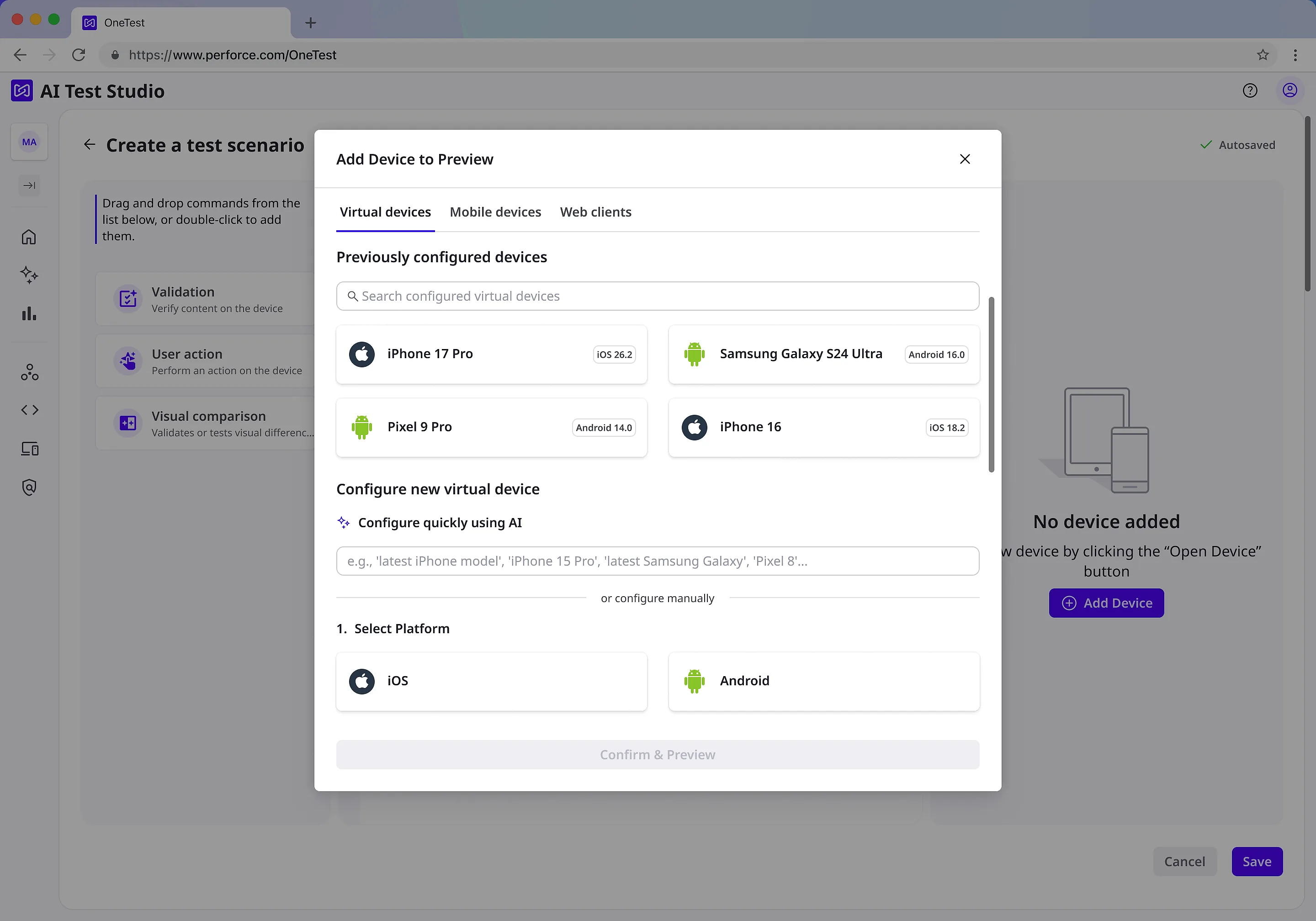
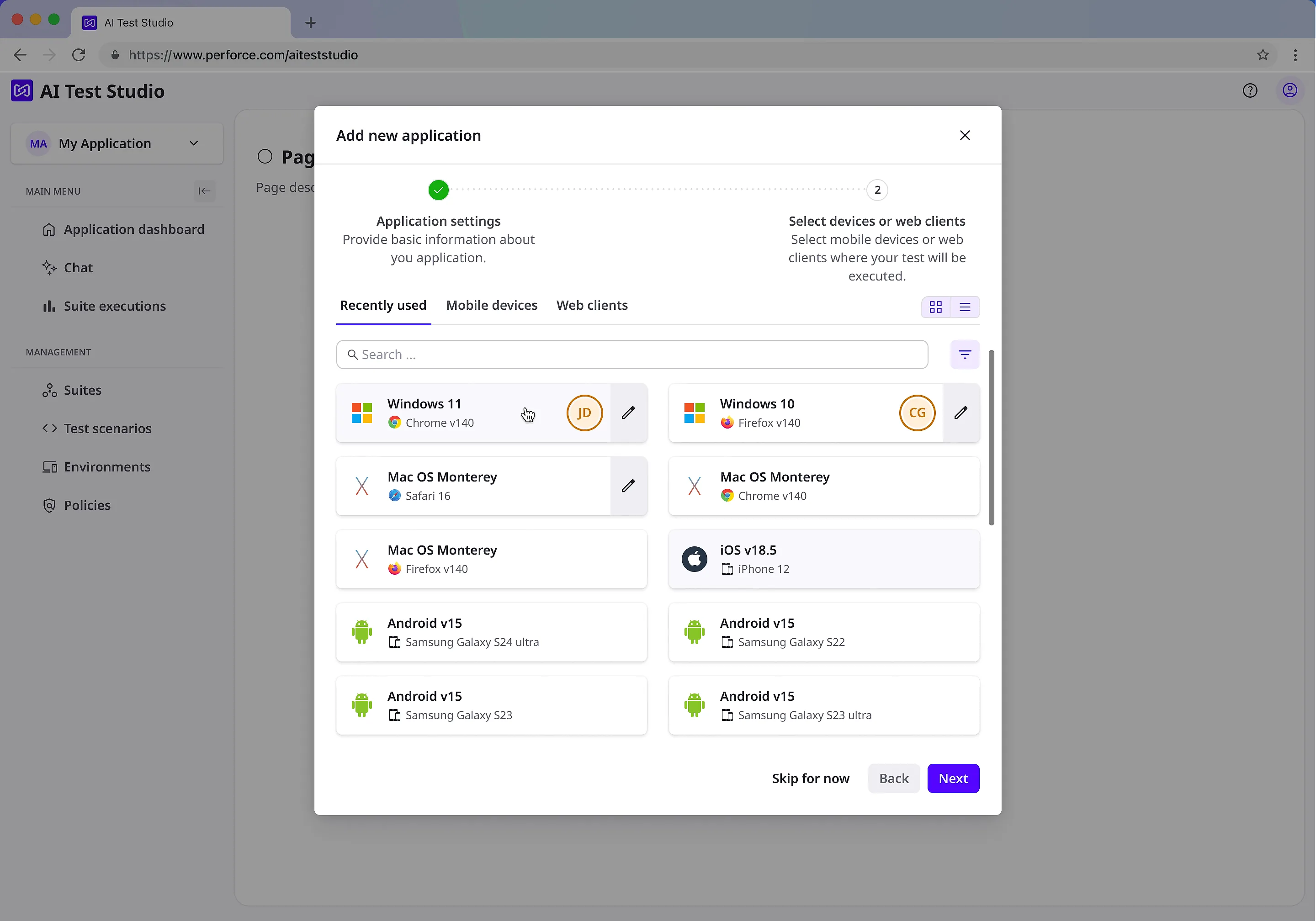
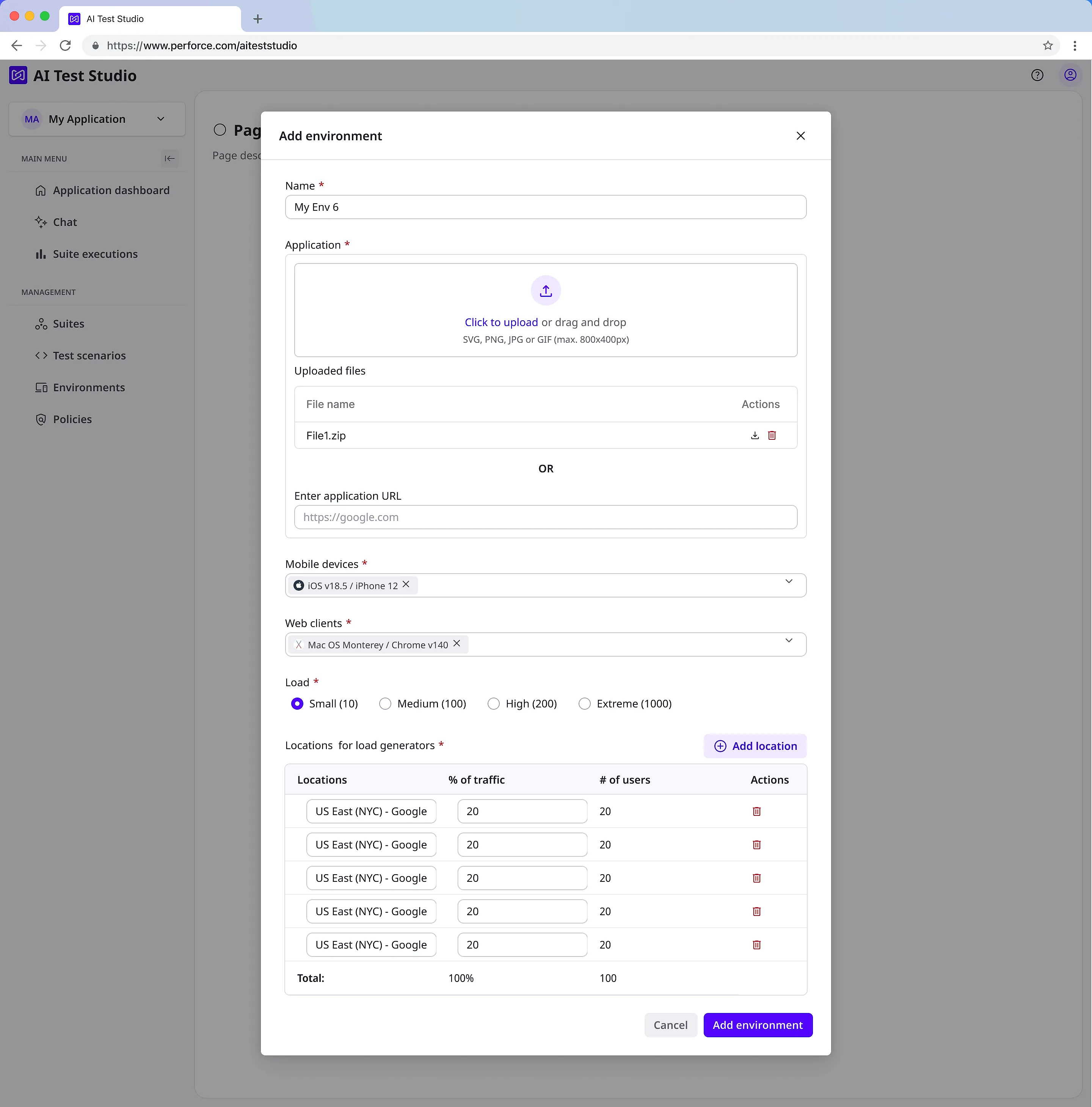
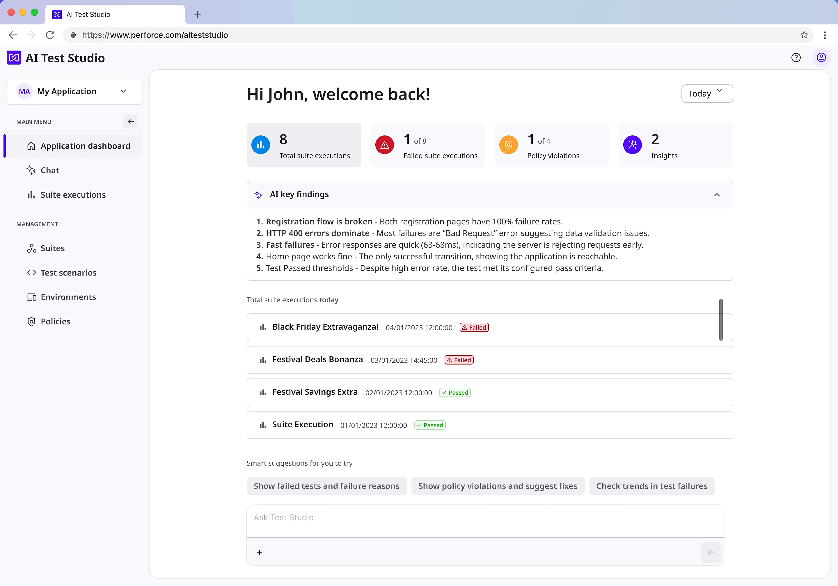
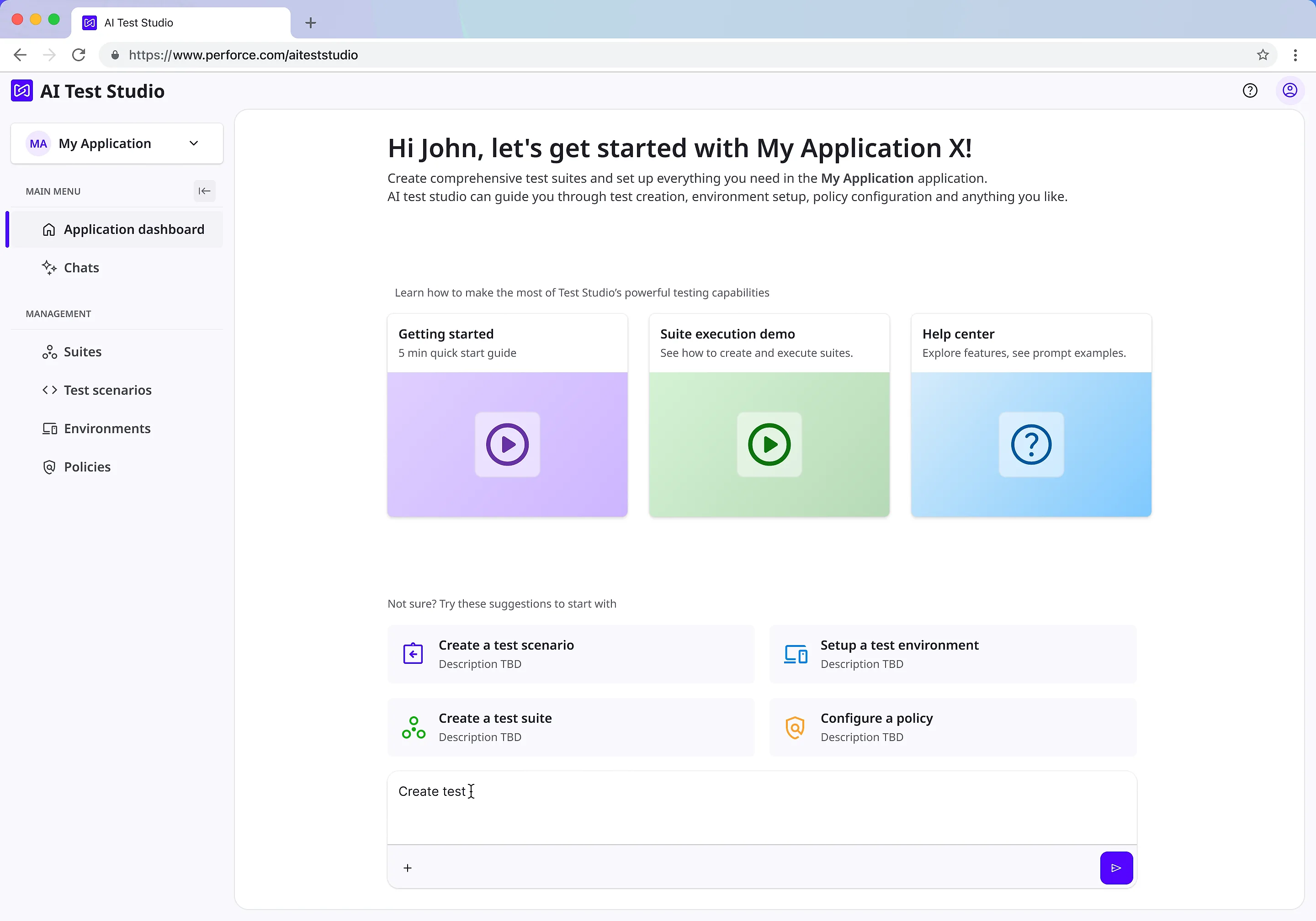
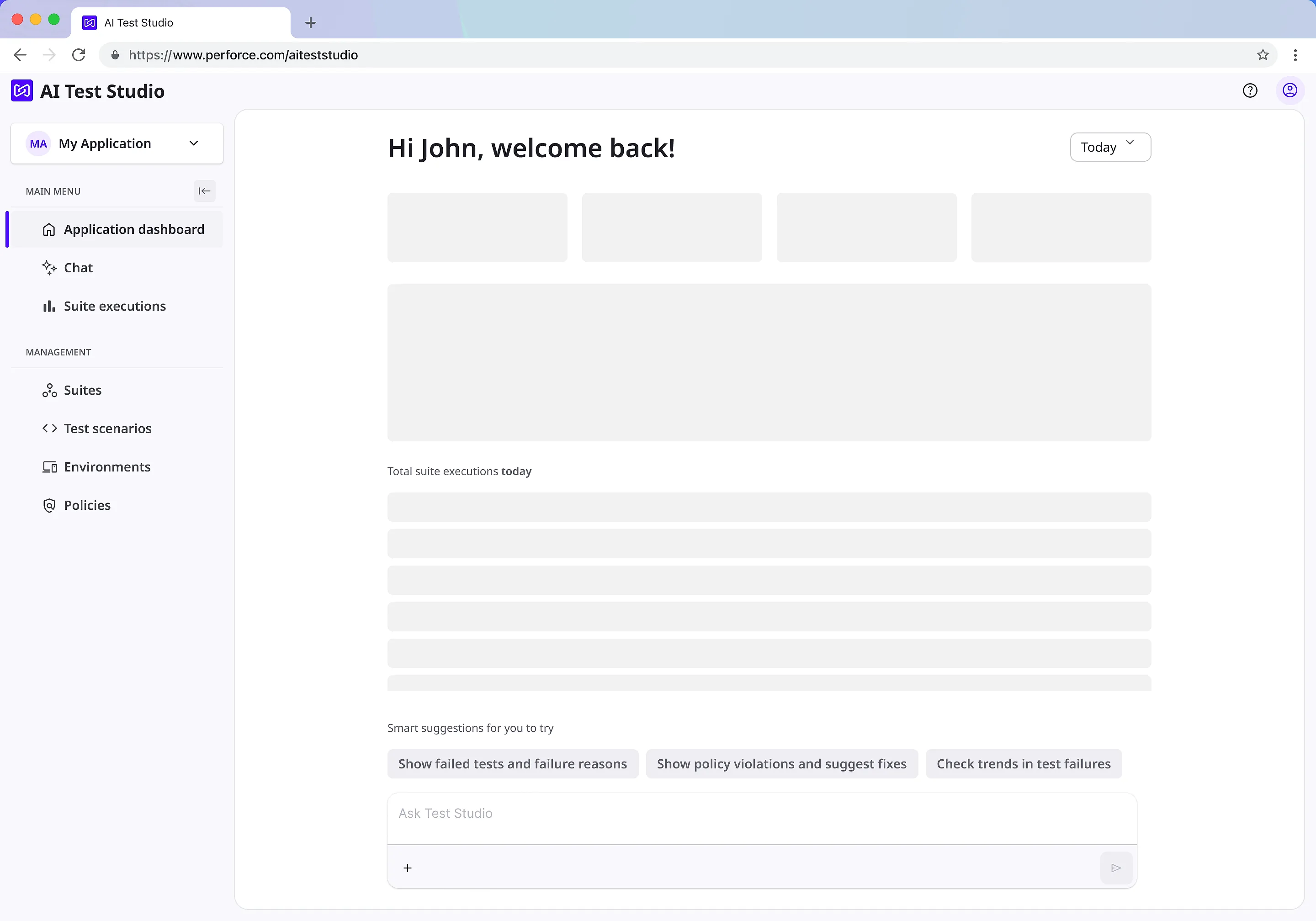
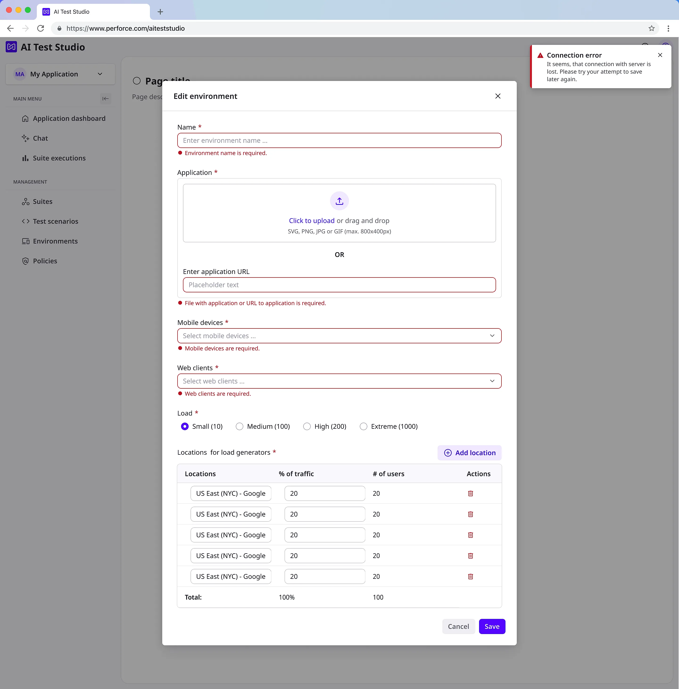
The interface, screen by screen
Design frames from the product file, not production captures. Every name, address and suite in them is fixture data that shipped in the Figma itself.

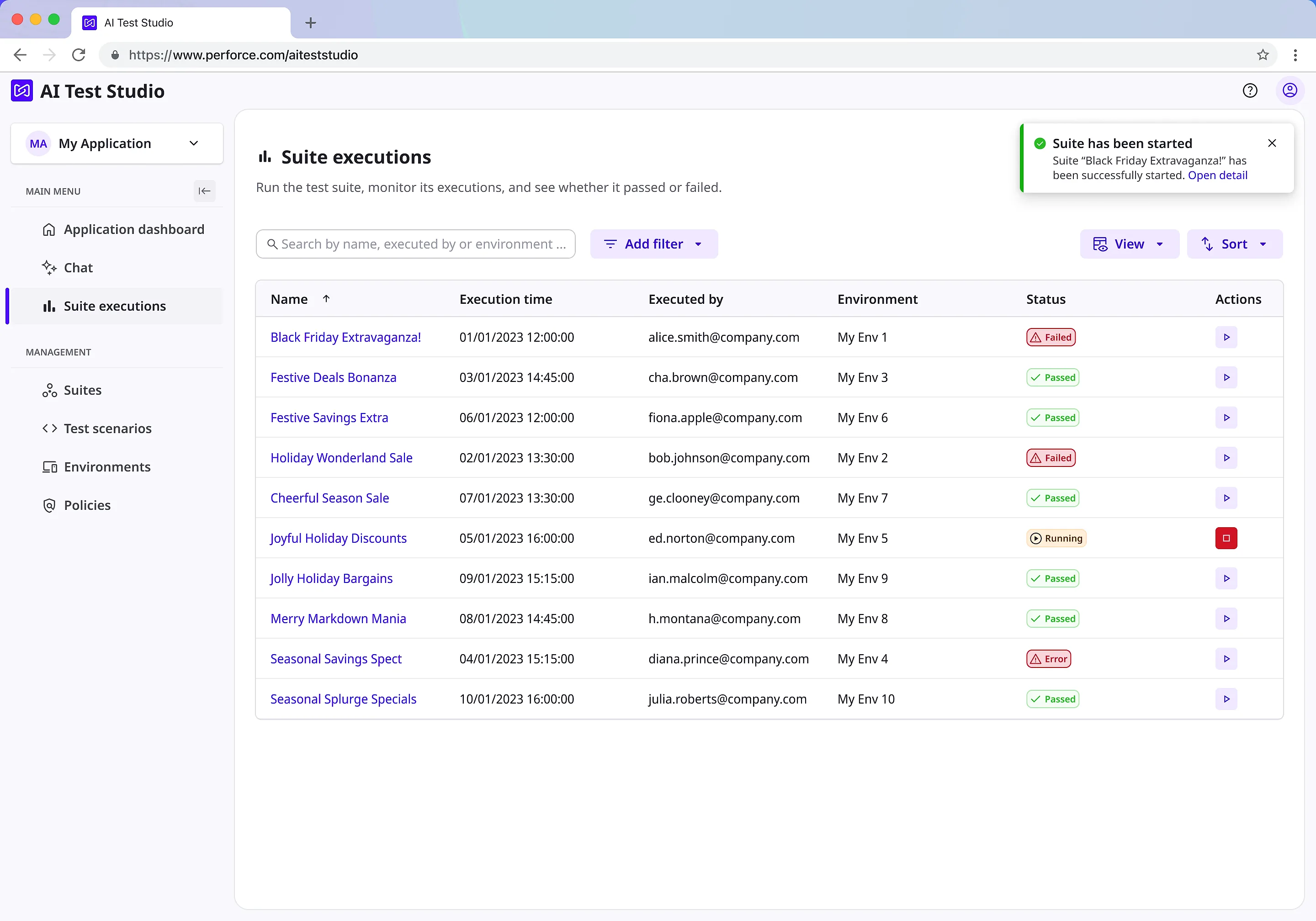
EVIDENCE
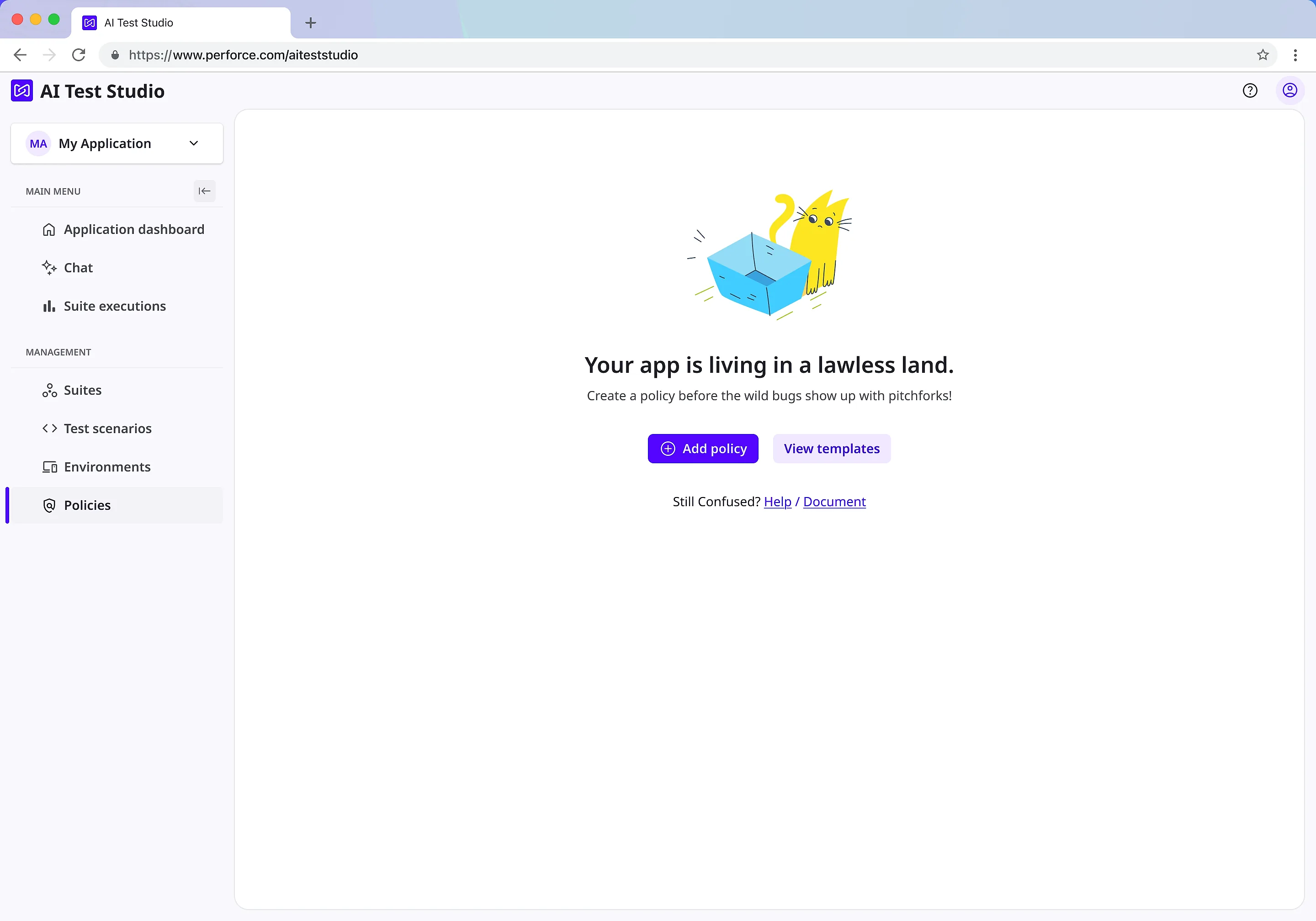
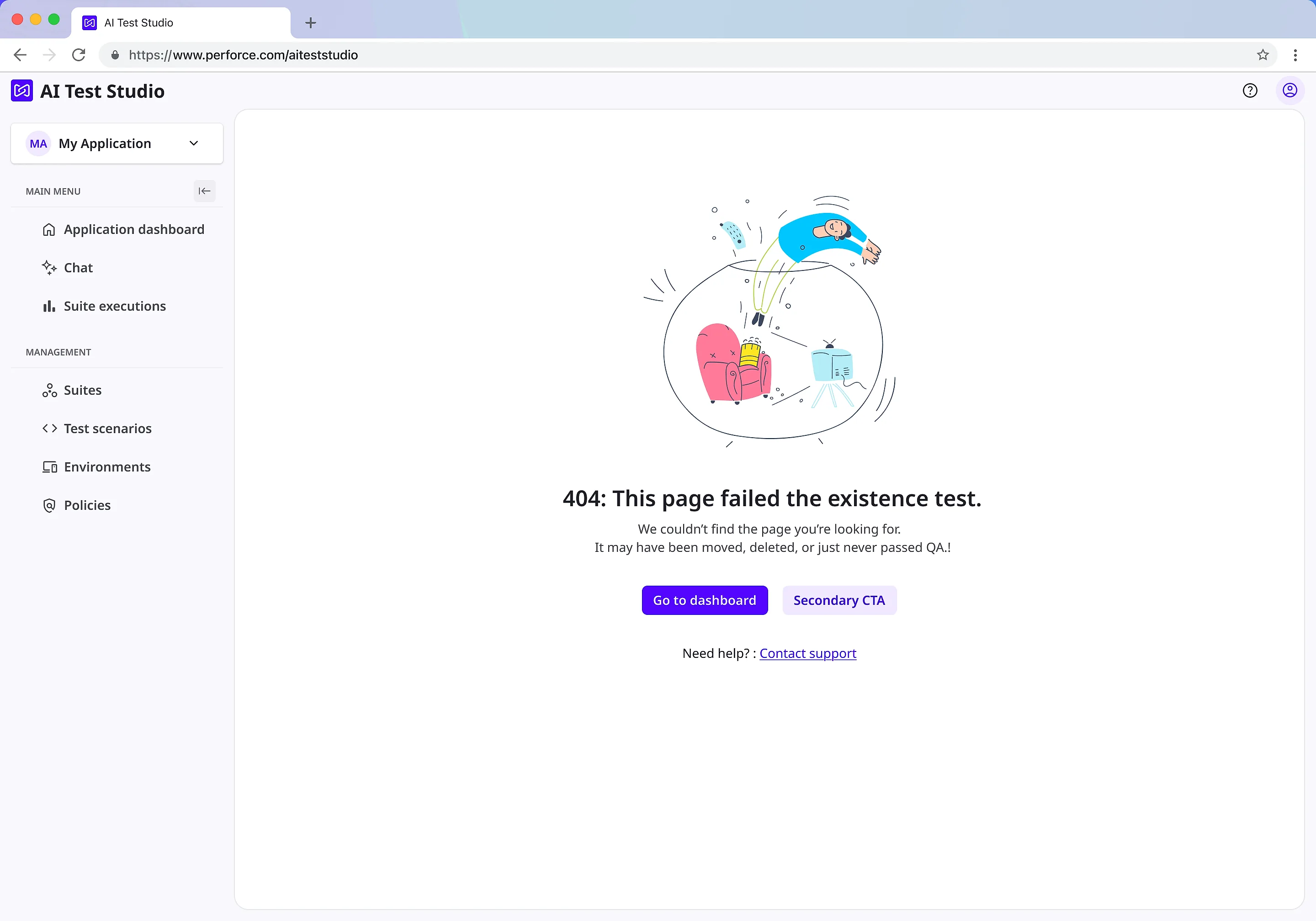
Every state I had to design
The happy path is the small half of the work. Loading, first run, empty, invalid, degraded and missing are six more screens per surface, and they are where an enterprise tool is actually judged.
TESTING
Most of what broke during testing was trust, not the interface.
Five sessions, split across two conditions: one group worked from prompts that guided their comprehension, the other got only a plain description and had to discover the rest themselves.
Given prompts
Guided comprehension
Given only a description
Unaided discoverability
5 OF 5
participants misread a feature whose only job was a hidden pass/fail judgement. With no visible logic behind it, every guess was different, ranging from SLAs to network security rules.
~20 issues turned up, across 8 categories.
EXAMPLES
- 01Couldn't tell if the AI was still thinking or had finished
- 02Couldn't tell a real, runnable test from a description of one
- 03"Regenerate" never said what would change, or why
- 04Weak feedback when the AI failed
Each one was a moment where the product asked for confidence it hadn't earned by explaining itself.
THE PIVOT
We shipped the safer path, then reversed it in a day once we saw the room.
The direction research pointed to was AI-chat-first. Engineering feasibility pulled that toward a structured, dashboard-led view instead, and that's what got built first.
Then the room wanted AI up front for a company demo. Because the AI-first direction had never stopped being prototyped alongside the dashboard, it was ready that same day. Inspectability had been baked in from the start, so the front door could change without rebuilding the house behind it.
PLANNED
AI-chat-first
The direction the research pointed to.
ENGINEERING REALITY
Dashboard-first
Feasibility pulled the team toward a structured, dashboard-led view. That's what got built.
COMPANY DEMO
AI-first, ready
The room wanted AI up front. It had never stopped being prototyped, so it was ready that day.
FINAL SOLUTION
Nine surfaces shipped under one voice
- Scenario authoring: a step editor with drag-to-reorder, device selection and script panel
- Suites and assignment: adding scenarios, engine tests and policies to a suite, then running it
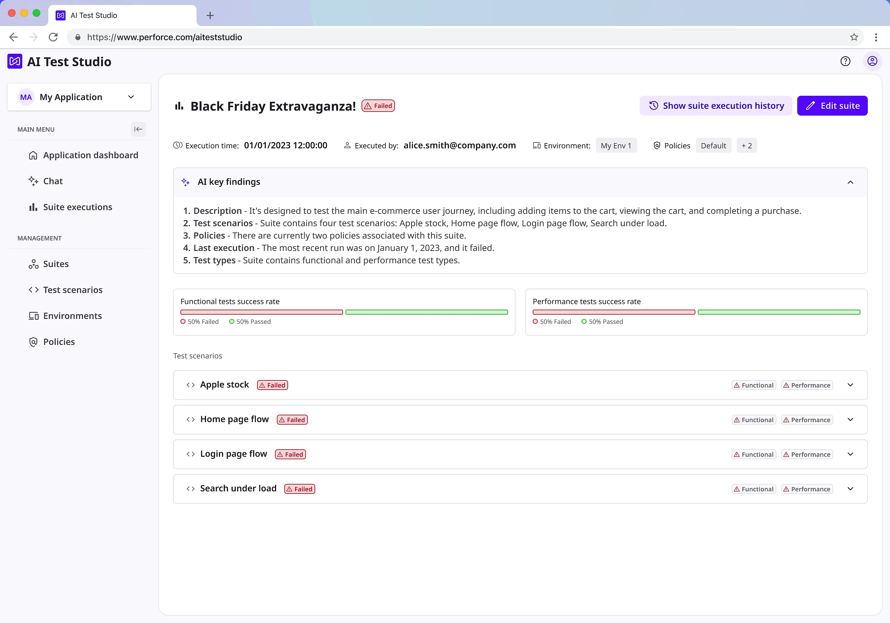
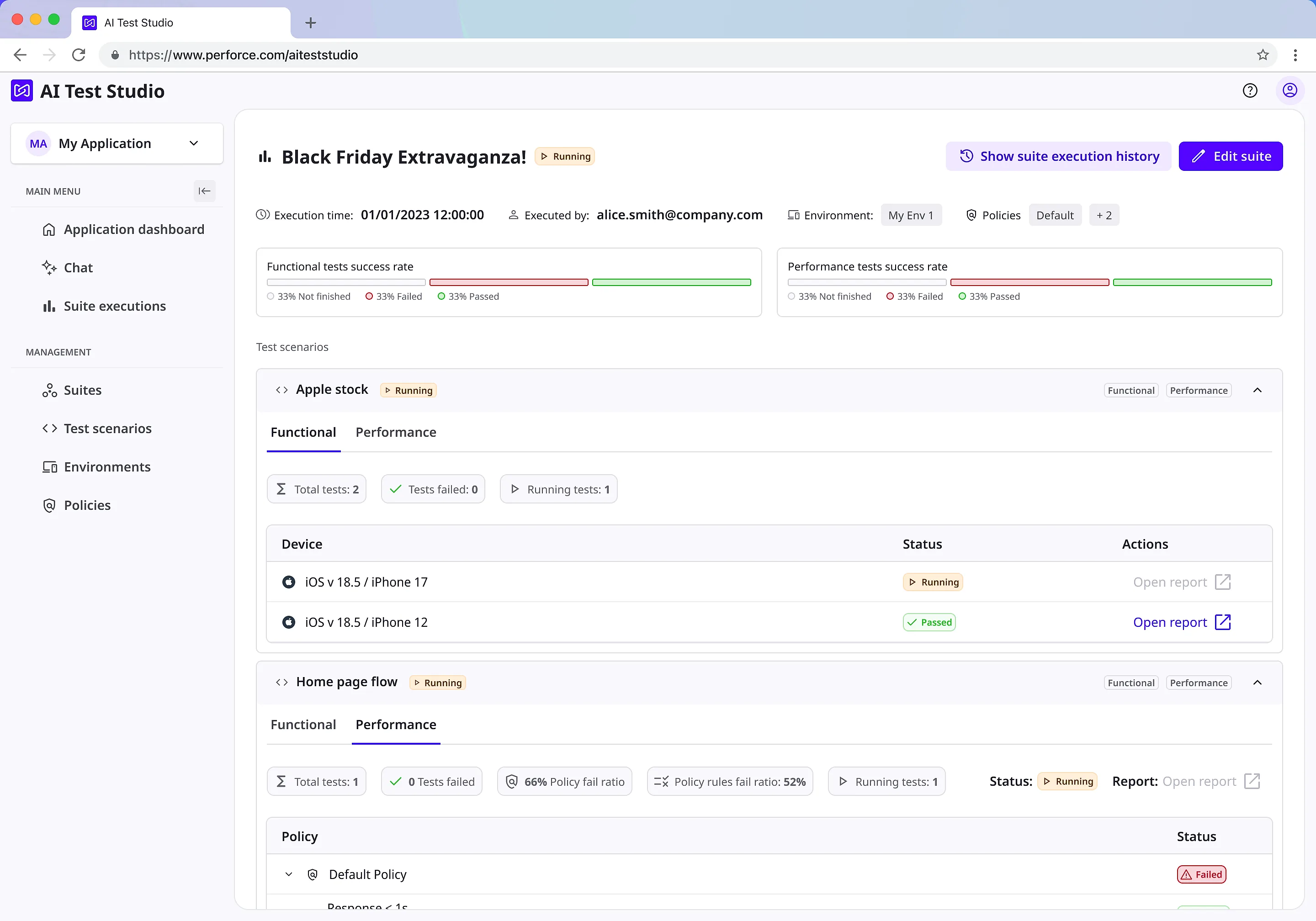
- Run analysis: an execution tree from run down to individual policy rule, with trend and success-rate charts
- Generative UI in chat: an agent-emitted widget registry rendered inline in the thread
- The product brand rollout across the shell
IMPACT
- 6–8 hrs → 15 min
- Time to author and run a test, start to finish
- 3 → 1
- Testing types collapsed into one flow
- 10,000+
- Real devices reachable from a single scenario
- 11
- Global data centres behind one request
Independently corroborated by an Early Access customer: a two-person team covering a slice of their apps reported the same shift, from six to eight hours down to fifteen minutes.
REFLECTION
Trust isn't one thing you earn once.
The top request after launch wasn't a new feature. It was a way to trial-run what the AI had built before committing to it, the exact gap testing had already found. For one enterprise customer, trust had nothing to do with the interface at all: they wanted their own AI model plugged in, so their test data never left the building. "We removed the technical barrier" is a claim, not a fact, until you've watched someone who isn't an expert actually try. Trust is earned separately by a person, a team and an organisation, and it doesn't carry over from one to the next.
THE LINE THAT MATTERED
"We removed the technical barrier" is a claim, not a fact.