Industry
GovTech
Company
CivicPlus
Building a Design System from Scratch for CivicPlus

Project Overview
During product audits of multiple websites, we noticed a lot of inconsistencies, so the team decided to create a Figma Component Library. This would help resolve inconsistencies as well as reduce the time it takes to redesign or create a new website or product on Figma, where we keep all the components under one file.

As a UX Designer, I collaborated with fellow designer and sometimes were guided by the team. This effort reduced designing time to a very significant amount.
The Problem
Why CivicPlus needs a design system?
CivicPlus has more than 11 products and an extensive network of websites and technological solutions for the government. I have worked on more than 6 products and noticed a lot of inconsistencies during the first quarter of my work. We needed to redesign the CivicPlus to eliminate the inconsistencies that had crept into our UI.
Also, while redesigning a product, it would take a lot of time to find the components needed which are spread across multiple files, increasing design time.
Goals
After getting approval from the team during the sprint retrospective, we just wanted to set some goals for how we're going to deal with the situation.
Make sure the design library is clear. The naming convention should be simple.
New designers should understand how to use the design library. If not, the system should be laid out in such a way that they should be able to find things for themselves.
Developers should be able to develop with ease. Components, colors, and states should be coded as a design library.
First focus on the essential components like (Buttons, inputs, colors, type scale, etc.)
Build Version 1 of the design system by having the Component library, style guide, and states. 6. Be kind to yourself. It’s a long process. It’s important not to get overwhelmed with everything that needs to be done.

Design Process
Designing our Design System:
Once we had the goals and knew what we needed to do, we started creating the smaller components and then we jumped into creating larger components. Components are one of the key building blocks of the design system. Their systematic reuse helps to create visual and functional consistency across products. All the components in the CivicPlus have been designed to work harmoniously together, as parts of a greater whole. Our approach was to involve the team to participate with ideas and feedback. It took several months to build, improve and develop. In this project, I will present some of the major highlights.
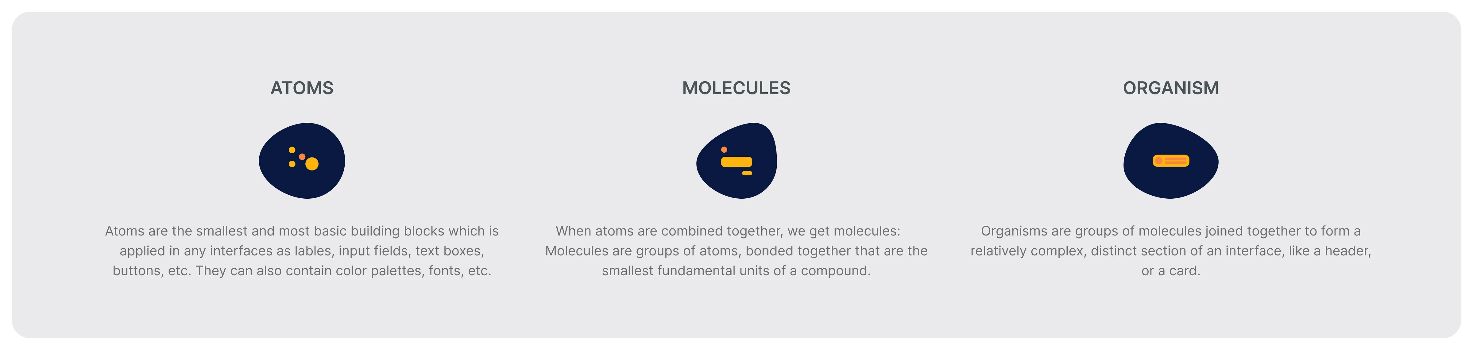
Modular Building Blocks:
The most efficient method out there for organizing the Design System or a design component library that I’m familiar with is the Atomic Design method. The atomic design provides a clear methodology for creating interfaces that focus on design elements and their combinations. It is also useful for crafting a design system that promotes consistency and scalability. In a nutshell, all of our components are organized into one of the following: Atoms, Molecules, Organisms, Templates, and Pages.
Results
Developing a Design Component Library significantly reduced inconsistencies and the time required for designing or redesigning products. Here are some of the components, and style guides we designed.
Grid System:
Desktop Breakpoint (1440 Variable):
For the CivicPlus desktop grid system, we used an 11-column grid with a 20px gutter, adjusted to the right, and a 50px margin variable. In a 12-column grid, each column is 100px wide.
Mobile Breakpoint:
For the CivicPlus mobile grid system, we used a 4-column grid with an auto width, a gutter of 20px, and a 10px margin variable. In a 4-column grid, the grid was stretched.
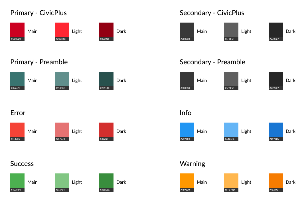
Colors:
Colors are going to be our main building block. So, while designing CivicPlus, These are the following colors needed as a minimum:
Primary: Usually the brand color.
Secondary (Optional): Should complement the primary and not compete for attention, its purpose is to signal elements with secondary importance.
Grays: Approximately 4 – 6 shades.
Support: Success (Green), Warning (Yellow), Error (Red), and Information (Blue)
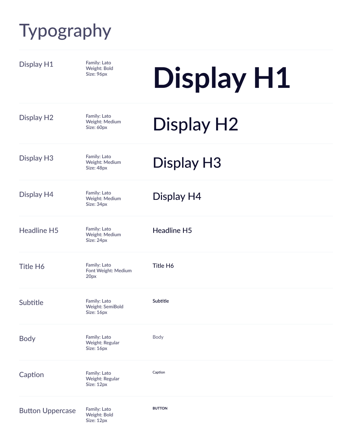
Typography:
The typographic scale determines which typefaces will become a standard, but also how we organize a consistent hierarchy, which is going to build a predictable information architecture across the product. By analyzing and understanding CivicPlus's typographical needs, we’ve used the versatile and scalable 'Lato' font, family.
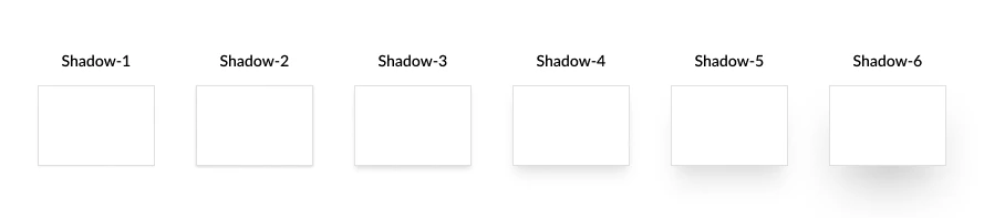
Elevations:
Shadows indicate an object's relative elevation. Shadows are used to signify elevation — how much an element is off the surface.
We started defining my smallest shadow and largest shadow, and then we filled in the middle with shadows that increased in size linearly.
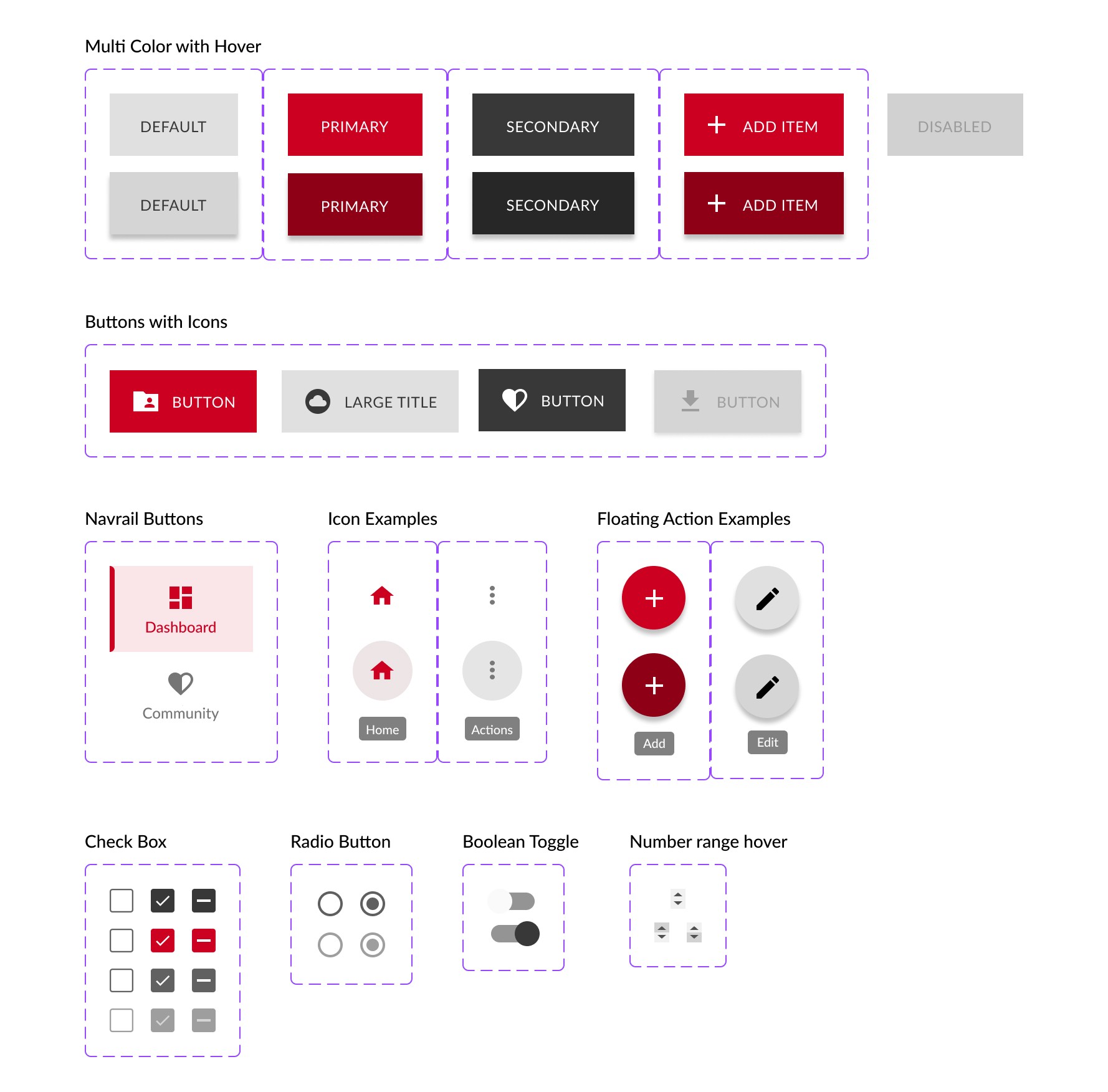
Button:
The primary button is probably the most reused component in any Design System and it will usually be the safest action the user can take. So, we should understand that a component behaves in different ways to communicate with the user. This communication helps the user to perform his/her action.
Understanding the different states of a component is more important than investing time in the outlook of a component.
Here I have displayed varied states of a button.